Location Delivery Methods
Making it clear how each store location is set up online
- Role
- Sole designer
- Timeline
- 2024
- Team
- Product, Engineering
- Surfaces
- Admin
- Status
- Shipped — Summer '25 Edition
One checkbox silently added shipping rates somewhere else
When merchants add a new location to Shopify – it can be one of many things – a warehouse, a storefront, or a temporary popup. To set up each location, they must first add that location to their admin, then setup those methods (Shipping, Pickup in-store, Local delivery, or a combination of the three).
The issue was that the location page didn’t communicate any of this. Instead, it had a single checkbox asking if they would fulfill orders from here. It was not clear how this related to shipping, in-store pickup, or local delivery.
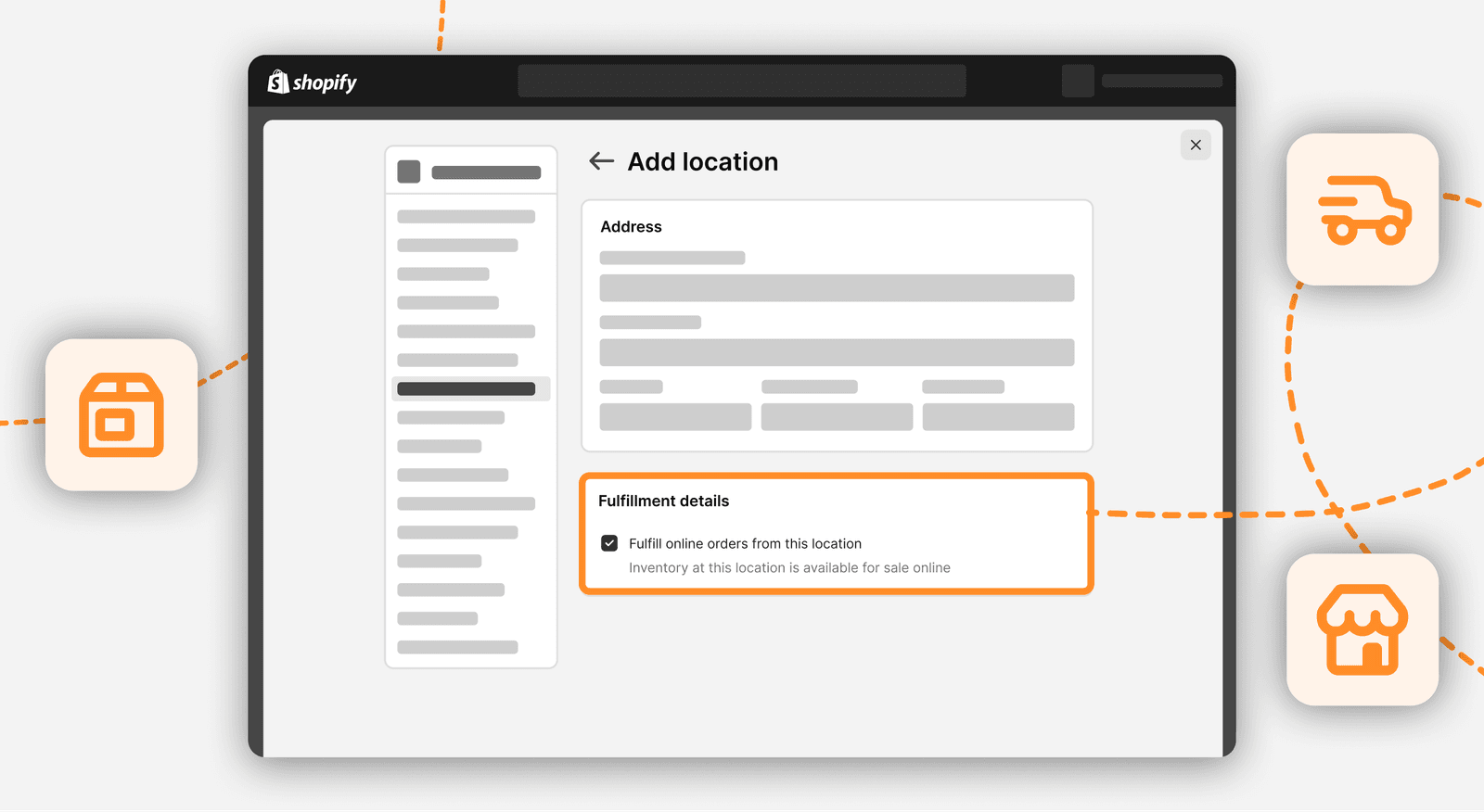
Checking this box would also have two very different results – neither communicated to the merchant, and both with potential negative impacts.
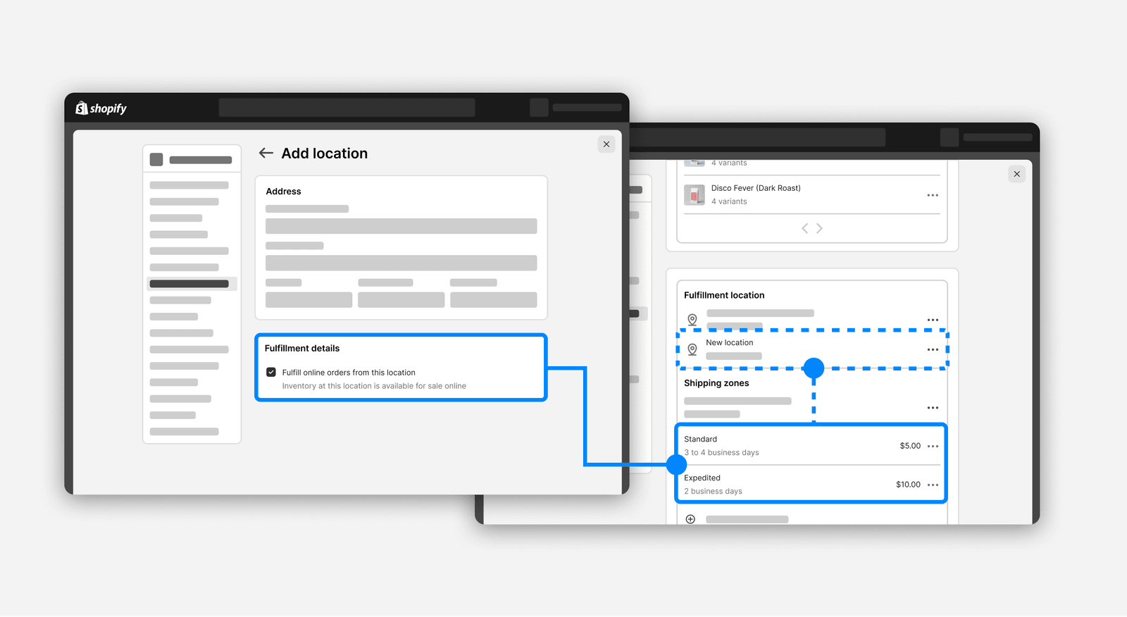
If a merchant had never changed their shipping rates yet – this would automatically add those rates to this new location. Great for a new merchant who doesn’t think to add them manually, but bad for a merchant who doesn’t want their store inventory to suddenly be sold online without their knowledge.
If they had made any change to their rates – it wouldn’t do anything. With no call to action to do anything, new merchants would need to figure the next part out themselves.
This uncommunicated logic contributed to a hesitation from merchants to enable pickup in-store – with many merchants assuming shipping was required to have this on. It was our hypothesis that a quick change could help remove this source of confusion.
A banner couldn’t fix a structural problem
The project started scoped as a quick copy change: clearer wording, and maybe a notification if rates were added. As we explored this further, it was clear that a generic copy change was not clear enough, and a dynamic change increased scope with very little value.

Working with the team’s developers, we discovered that the logic to make the quick fix more dynamic could also be used in another way – unlocking a fix that wasn’t significantly more expensive to build, and improved clarity much more.
Every delivery method now has an explicit on/off
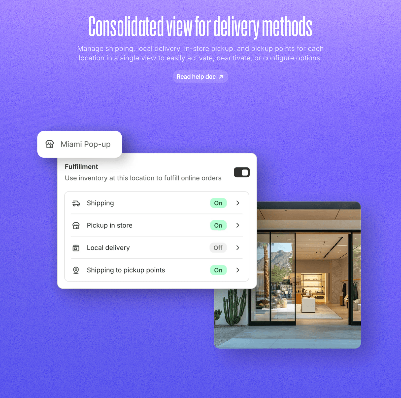
The pivoted approach shows each method (shipping, pickup in-store, and local delivery) statuses clearly on the card – showing it as On or Off.
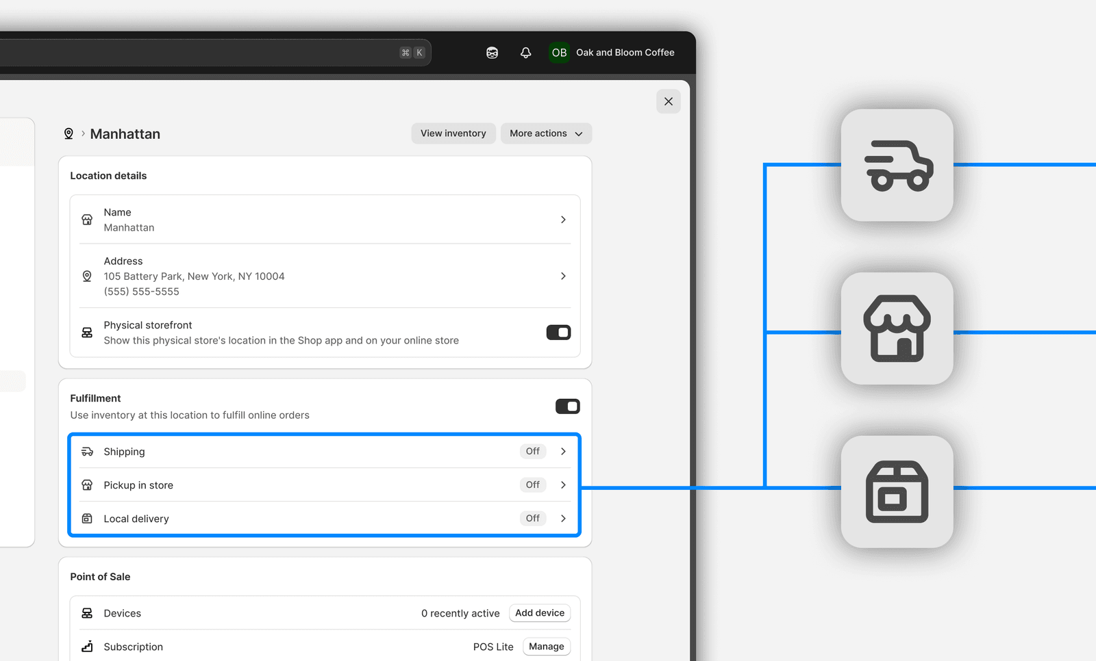
Nothing activates silently. The auto-assignment logic was removed entirely, as the new [Off] status clearly communicates more work needs to be done – now with a breadcrumb to the settings page to do this.
The methods are evenly stacked. The newer delivery methods added (Pickup in-store and Local Delivery) are now placed alongside Shipping. Previously, there was hesitation for merchants wanting to offer pickup without shipping.
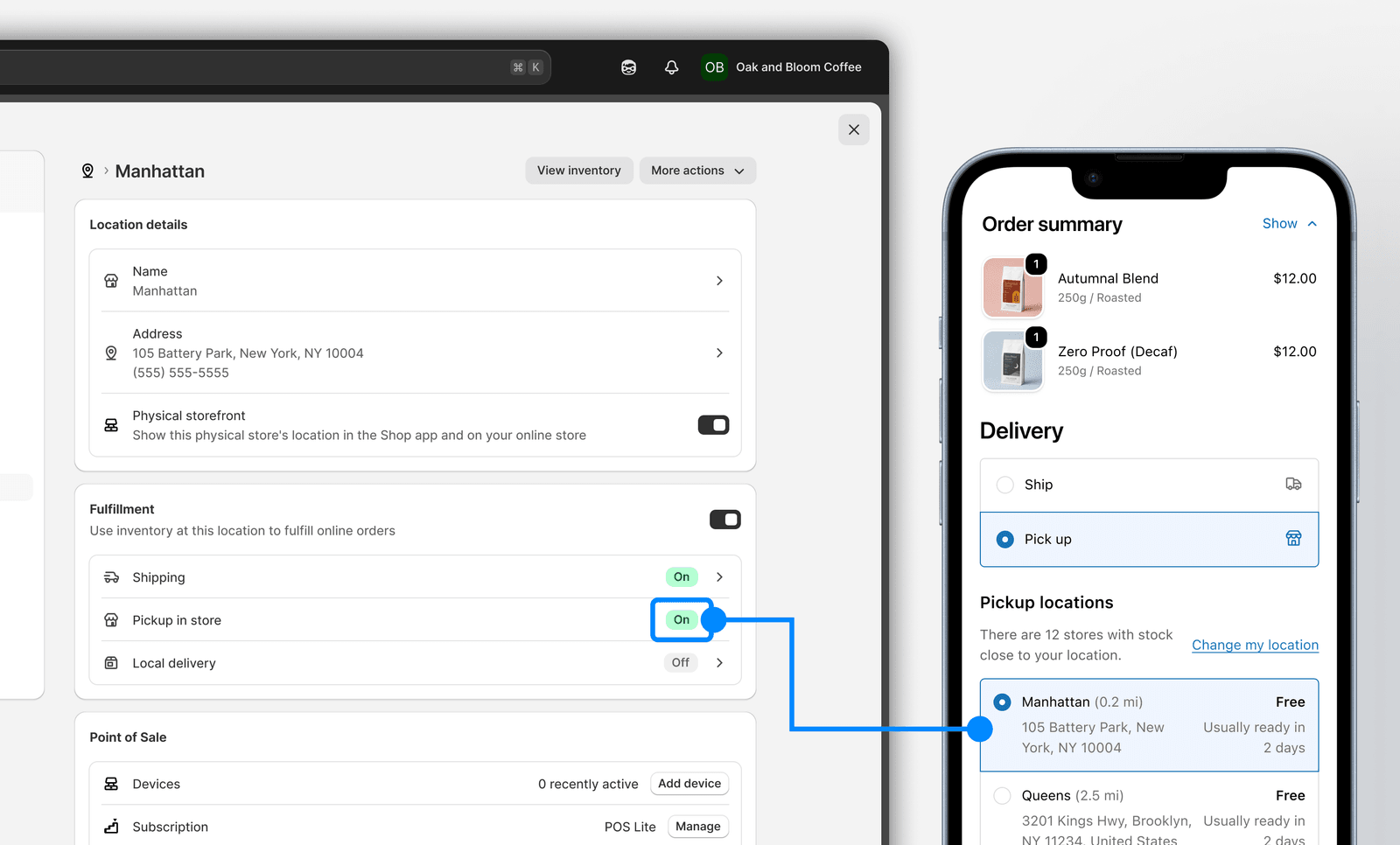
The new component gives merchants an at-a-glance view into the different methods, when previously this was fragmented across each method’s settings page.
A quick fix that grew into a better one
Announced in Shopify’s Summer ‘25 Edition as “Consolidated view for delivery methods”, it prominently featured our quick fix, now grown into something more impactful.
I’m glad we took a deeper look into this rather than assume it would be a quick copy change. Sizing both options with developers is what let us remove the confusing logic, and replace it with a clearer component that made location management easier to understand.
More case studies
Rebuilding how stores price shipping, to match how merchants actually think about it
Letting stores move stock between locations, so one missing item stops blocking an order